BlogPost#5: Title Sequence
- Iris Li
- Nov 28, 2022
- 5 min read

Updated: Jun 16, 2023
The difference between an opening credits and title sequence
The film opening is to introduce the main content or story line of the movie, the background of the protagonist, and basic information about the story.
Title sequences should be more comprehensive and more detailed than the beginning of the movie, and will include directors, actors, producers, post editors, and some information about film production. The background board will also add some small details that are closely related to the movie, or make a small pavement for the later development of the movie.
The importance/purpose of the title sequences
Tile sequences are extremely important for attracting an audience. Commonly film title sequences often the feature names of the director and main actors, particularly if the actors are famous as a form of targeting an audience.
This is also important for films where a certain director frequently casts a particular actor(s) as their leading role.
Title sequences are a powerful expression of motion graphics. They are a prelude to the movie. They engage the audience by hinting at what is about to start, whether it's a movie, TV show, or Web animation. One of the primary functions of a title sequence is to set the tone of the movie you are about to see. Tile sequences are extremely important for attracting an audience.
A title sequence consist of
Commonly film title sequences often the feature names of the director and main actors, particularly if the actors are famous as a form of targeting an audience.
A title sequence is the method by which films or television programs present their title and key production and cast members, utilizing conceptual visuals and sound. It also helps establish the setting and tone of the program. It may consist of live action, animation, music, still images, and/or graphics.
Techniques can be used:
The three main codes and conventions:
Audio codes, Symbolic codes, Technical codes.
Different genre with different codes and conventions: links to the genre research.
In your opinion, how important is a title sequence?
A good title sequence could attract more audience and viewer to make the film popular and success. It is an essential part of the film.
Saul Bass and his legacy
"For the average audience, the credits tell them there's only three minutes left to eat popcorn. I take this ‘dead’ period and try to do more than simply get rid of names that filmgoers aren't interested in. I aim to set up the audience for what's coming; make them expectant."

Saul Bass was a Bronx-born graphic designer who took his New York style to California and became famous for his work in film and classic logo design. He studied in New York at the Art Students' League as a teenager and developed a unique style that is both recognizable and memorable. He is best known for his design of motion-picture title sequences, film posters, and corporate logos.
He showed the audience as well as filmmakers that the title sequence of a movie doesn’t have to be plain letters that gives credit, but also a tool to intrigue the audience and help establish tone and create enigmas.
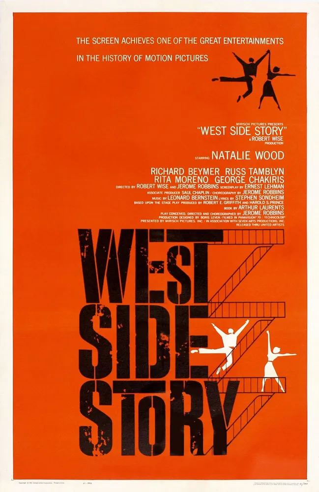
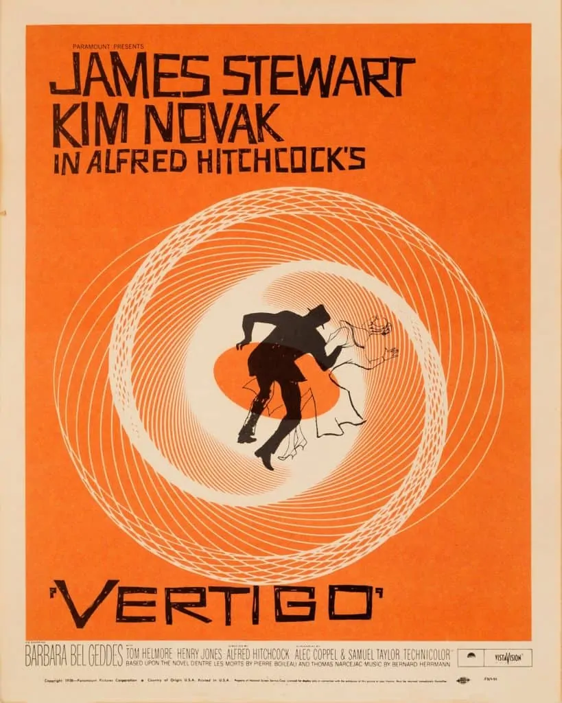
During his 40-year career Bass worked for some of Hollywood’s greatest filmmakers, including Alfred Hitchcock, Stanley Kubrick, Otto Preminger, Billy Wilder, and Martin Scorsese. He became well-known in the film industry after creating the title sequence for Otto Preminger’s The Man with the Golden Arm in 1955. For Alfred Hitchcock, Bass designed effective and memorable title sequences, inventing a new type of kinetic typography, for North by Northwest, Vertigo (working with John Whitney), and Psycho.
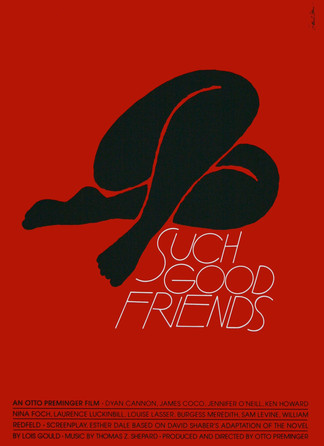
His famous graphic design works:

Seymour Chwast

Known as a master of historical styles and movements, graphic designer, Seymour Chwast, is widely appreciated for his diverse body of work and lasting influence on American culture. Less known is his work not meant for the media. His paintings, drawings, prints and sculpture are an outlet for personal expression and a means of communicating his deep political and esthetic convictions. http://www.seymourchwastart.com/about/
Seymour Chwast’s colorful and witty designs and illustrations have been used in advertising; animated films; and editorial, corporate, and environmental graphics. He has created over 100 posters; designed, written, and illustrated numerous children’s books; and developed many typefaces. In addition, he designed and illustrated The Push Pin Graphic and his current publication, The Nose.
https://areaofdesign.com/seymour-chwast/


The effects of the Second World War, which affected countries to varying degrees, and the United States to a lesser extent, made Cevalst want to do his part to make a difference.
"War is a subject that I've been picking at for years and I want to keep doing."
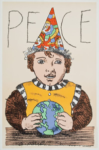
"End Bad Breath" is an anti-war poster designed by Chwast in 1968 (age 37) to oppose the U.S. bombing of Hanoi during the Vietnam War (1959-1975).
His other famous artwork:


Analysis on Title Sequence:
'The Great Gatsby'
The Great Gatsby is the quintessential Jazz Age novel, capturing a mood and a moment in American history in the 1920s, after the end of the First World War.
The opening title sequence of this film symbolizes the whole story of Gatsby’s life and dream.
Sound: The saxophone solo music foreshadows to Jazz Age - the time of imprudent opulent and lavish/luxury lifestyles. According to postmodernism by Baudrillard. This film was during the second phase, modernity. Jazz music usually affirms the noblest aspirations of character, individual discipline, perseverance, and innovation. Jazz has also indeed been identified as the metaphor of life, with everyone displaying some of the characteristics.
The jazz age: the U.S. had emerged as a world power. It is a time marked by frivolity, carelessness, hedonism, and excitement in the life of the flaming youth. The young generation has been called the lost generation during that period.

The Iona logo in The Great Gatsby has a revolving Earth in place of the circle. This means that the "BZ" and "TRUTH BEAUTY FREEDOM LOVE" are absent. Also, the "IONA" tower is pushed down. It is in black and white and is put on the same background as the Warner Bros. Pictures and Village Roadshow Pictures variants. A life lived, in fear is a life, half lived - foreshadows moral decline an itch for money, desire to take pleasure in squandering, and wickedness - determining qualities of the Jazz Age.

The gold medal logo of 'JG' represents Gatsby’s hard but wealthy life. He had to pass through his hard wartime. Turning Grey into Gold & Walking through the Golden Gate symbolizes Gatsby's acquisition of wealth and status, establishing an illusory image while being tainted by the money gained from crime and the depravity of high society. He lost himself throughout his life. As the medal bears towards the darkness this symbolizes how Gatsby is enchanted by Daisy chasing towards her. When the medal diminished and shifts to the glowing green light, this connotes that all the things he has done, are all for her, all for the illusion. During this process, he lost himself when chasing his dream. The director leaves an enigma code at the end the shining green light, which constructs moments of mystery to intrigue the viewer. The green light on the other hand is also a symbolic code that conveys a deeper meaning, was the symbol of his desire, Daisy, and his rich life. He chasing his dream. The color green connotes greed, and jealousy, which strongly portrays Gatsby’s mentality. He wants too much. The green light was just an illusion that confused him, but ultimately deceived and destroyed him.


Comments