BlogPost#4: Studio Logo
- Iris Li
- Nov 24, 2022
- 6 min read

Updated: Jun 16, 2023
STUDIO LOGO (Production logo):
-A logo used by movie studios and television production companies to brand what they produce and to determine the production company and the distributor of a television show or film.
-Production logos are usually seen at the beginning of a theatrical movie or video game (an "opening logo"), and/or at the end of a television program or TV movie (a "closing logo").
Why are studio logos important?
-The studio logo is the identification of a studio or a company.
-The studio logo grabs audience’s attention, the audience expected to see that as the first introduction of the studio, and it could help the production group to set up expectations for a film.
-The studio logo gives audience and viewers a general idea of the feeling and tone of the studio, since it takes the benefit of motion and synchronized sound.
-It could bring a positive recall about the studio and therefore build a loyalty viewer base.

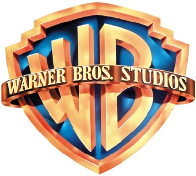
The 'big 5' studios list:
Universal Pictures;
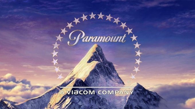
Paramount Pictures;
Warner Bros. Pictures;
Walt Disney Pictures;
Columbia Pictures
The production companies, and studios are 'known' for making Thriller films:
Hammer
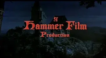
Hammer is a British production company based in London, founded in 1934.
It’s commonly recognized for its series of gothic films and thrillers. Hammer dominated the horror film market in their most successful years. It has various partnerships with major united states studios such as warner bros. It’s responsible for many classic thrillers such as Dracula, Frankenstein and more modern ones such as the woman in black.
Hammer has created some iconic movies that represent the genre extremely well. Its also recognized for making tense and suspense movies.
Warner Bro's

WARNER BROS. ENTERTAINMENT INC. is a fully integrated, broad-based entertainment company and a global leader in the creation, production, distribution, licensing and marketing of all forms of entertainment and their related businesses.
When researching more into the company and the types of films they produce the results were very varied due to the vast amount of films they make. They produced several successful thriller films, such as Inception, The Dark Knight and The Shining.
They have such a wide target audience furthermore cater for all types of genres. Although despite this, the thriller movies they have produced are all very good.
Blum-House
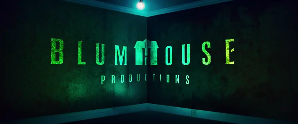
Blum-house Productions ( also known as BH Productions or simply BH) is an American film and television production company founded in 2000 by Jason Blum.
It is known mainly for producing horror films, such as Paranormal Activity, Insidious, The Purge, Split, Get Out, Happy Death Day, Halloween, Us, The Invisible Man, Freaky and The Black Phone.[4][5] It has also produced drama films, such as Whiplash and BlacKkKlansman, which both earned nominations for the Academy Award for Best Picture. Get out and BlacKkKlansman won Academy Awards for Best Original Screenplay and Best Adapted Screenplay, respectively.
New line cinema
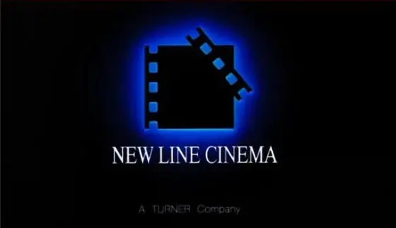
New line cinema is a popular distributor for thriller genre films due to its popularity. The distributor has released films such as 'The Butterfly Effect' and the famous thriller 'Seven'. This is a good distributor as the thriller films are all alike and follow the connotations therefore, it would be similar to those.
Dimension Films
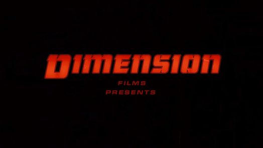
Dimension Films is an American film production company owned by Lantern Entertainment. It was formerly used as Harvey and Bob Weinstein's label within Miramax, which was acquired by The Walt Disney Company on June 30, 1993, to produce and release independent films and genre titles, specifically horror and science fiction films.
Blum House Production
https://www.youtube.com/watch?v=7AUSEiY0NFU
Starting with a heartbeat and the synthesizer music, the synthesizer music is eerie and artificial. Within the animation, the sound of the closing door, flashing lights, flying books, and a little girl wearing a white dress walking through. The use of a crescendo of the music builds up the tension. With the sudden quiet, the logo appears, and the color fluorescent green combined with the dark background creates a horror and thrill tone, which also connect to the genre. This helps the audience get into the mood of the film and makes the audience’s muscles to get tense. The soundtrack of the motion logo maintaining the careful balance of tension and revulsion to build fear.
Warner Bros. and New Line Cinema
This motion logo has smartly used the moving light bulb to switch the scene. The light bulb was moving left to right several times. The motion of the bulb creates a feeling of uncertainty, and panic for the audience, which builds a base of thrill and horror. They also used a crescendo to build up the tension, every time the change of logo, the volume of the synthesizer music increases, and the loudest sound was at the film title, which controls the fear feeling of the audience and also prepares for the film opening.
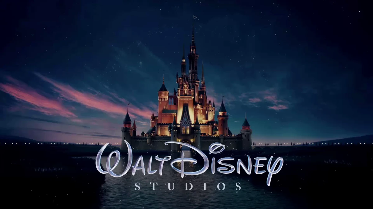
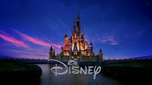
Evolution of Walt Disney's Studio logo:
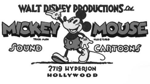
1929-1937
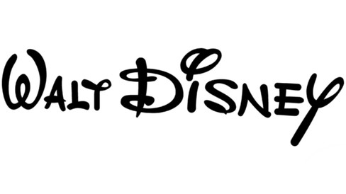
Walt Disney himself participated in the creation of the first brand logos.
One of the versions contained an image of a walking Mickey Mouse, which was already a symbol of the animation studio at that time.
Above the walking Mickey Mouse was the phrase “WALT DISNEY PRODUCTIONS Ltd.” A unique font was used for all parts of the logo, in most cases, an individual set of glyphs. 1985-2006
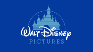
In the mid-80s, the graphic part was added to the text part. This is the castle located above the phrase “Walt Disney.” The film studio chose him as a fairytale symbol. The palaces are depicted in the form of horizontal stripes and are surrounded by a solid arch. A triangular flag is visible above each tower.
The graphic part of the logo appeared in 1985. It became a fairytale castle’s image since the animation studio is associated with magic, princes, princesses, kings, and queens. At first, the palace looked lined, but then another image appeared, more tangible and realistic. As conceived by the designers, it still changes depending on the plot of the cartoon or film. 2011-present
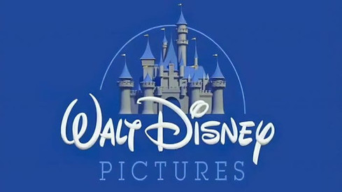
The current version is the same as the previous one, except the inscription. Instead of the full version, an abbreviated version is used – only “Disney,” the name of the cartoon company’s founder.
The media conglomerate never had an official font, but in 2000 the Justin Callaghan typographer tried to recreate it based on existing lettering. He developed two versions of the Waltograph: bold and regular with lowercase and uppercase letters. The company Walt Disney noted that if Mickey Mouse undertook to write memoirs, he would choose the font Waltograph.
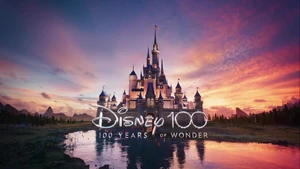
The new emblem is decorated with towers, windows, balconies, and flags. The animated star leaves a long line in the shape of an arch. But the creators did not limit themselves to this alone and, over time, adding even more details. So some festive fireworks and clouds expressed the magic of the brand. The castle, in turn, symbolizes romance, love, and a fairy tale.
But with the release of Toy Story, there have been changes in the cartoon world. Animators began to accompany each cartoon with their version of the logo so that the picture corresponded to the plot. For example, in Maleficent, it looks a lot like Cliffside Castle, and in Tron, it looks like a city of lights.

Summary: The changing in font affected my studio logo design, Disney changed several times to find the best and most fit font style to be their studio logo— The hyperbolic and stylized font. They chose the most memorable signature with the strange letter “D.” The remaining characters are also unusual: “T” looks like “Y,” and the dot above “I” looks like a large circle crossed out diagonally. They also deliberately done some variation on the typeface, between serifs and sans-serif (smooth and classic). The castle with the firework. All of those make up and accomplished Disney's most distinctive and iconic logo.
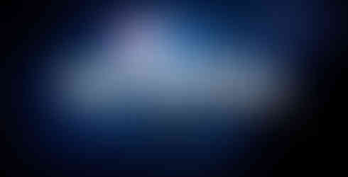
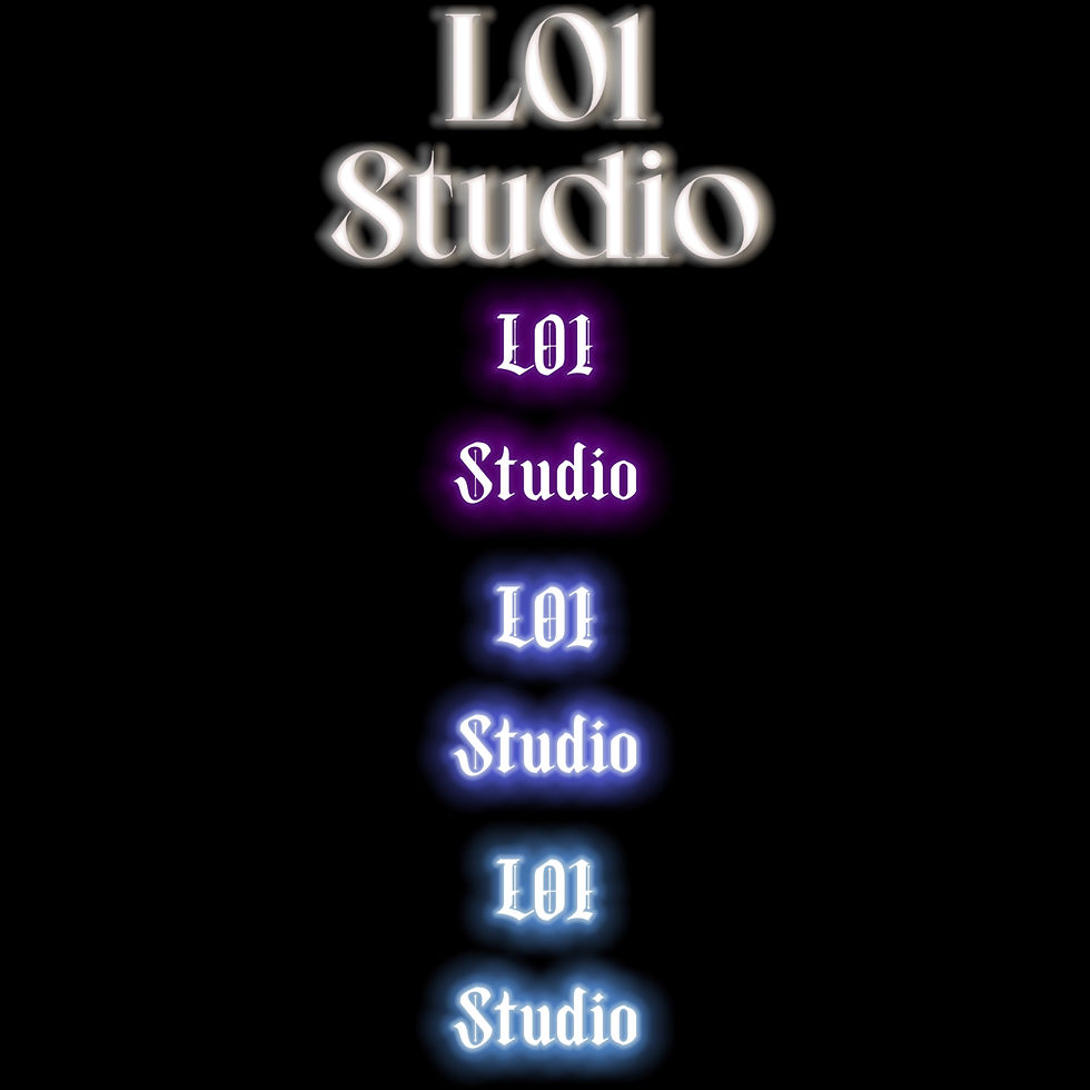
My studio logo:
After studied several famous studio logos, I designed my own studio logo for my two minutes film opening.
The name of my studio logo is "L01 Studio". This is the combination of my family name and my favorite number. 01 represents the new start of everything, similarly, this is my new start of media studies, so it could perfectly represent myself.
Font: For the color of my logo, I chose cold blue, because the color blue connotes mystery, it could fit to my genre. I tried purple and white, but the effect of those two color did not meet my expectation. The font style is the black letter, a classic, ancient style. The reason I chose this is because this could set up a feeling of serious.
The gothic style font also connected with the clock soundtrack, these linked with my genre thriller. Moreover, the purpose of the shaking effect is to build up the tension, highlight the feeling of turmoil and anxious.
Font Studies:

Draft:
Lastest Approved:


Comments